Making Art for the Badges
2018-10-20 · 4 mins
An important component of the acrylic badges I’ve been making is the artwork displayed in the center. In order to get quality results, here’s a bit of information on how to put together artwork for them.
Engraving is done on my CNC machine with a V-bit. Instead of a typical cutting device’s flat end, it is shaped in a V. This allows it to cut smaller or larger holes depending on how far down it is plunged into the material.
It is by far the easiest for me to use SVG (or other vector) formats. Unlike bitmaps, it is easy to tell the software what shapes to cut. Primarily artwork should be lines or outlines of the desired shapes. Color is irrelevant in SVGs. If done as a bitmap, color is important and used to identify edges.
Lines
When using lines, the variation in thickness will show up. Lines should generally remain as thin as needed. Smaller lines will still have a great contrast against the background. As lines get thicker they also get deeper into the acrylic. However, thicker lines can be extra contrast where needed. Note that because light comes down from the top, the upper part of the groove will be brighter than the lower part.
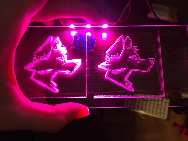
This is an extreme example of how thinner lines can look much cleaner. The first frame was a result of a poor tool choice but does demonstrate how thick lines make the whole thing look busy. Even the right frame has lines slightly thicker than they could be.
Filled Shapes
We can do a lot with filled shapes depending on what’s needed. Let’s look at some examples. This SVG file is from Wikipedia.

All of the details are done as outlines of the desired lines. A large filled area does not always mean the entire area will be engraved! The software I use to process files allows me to select how to engrave things. Typically trying to engrave a large area results in an ugly texture. It is almost always better to have a much thinner line instead.
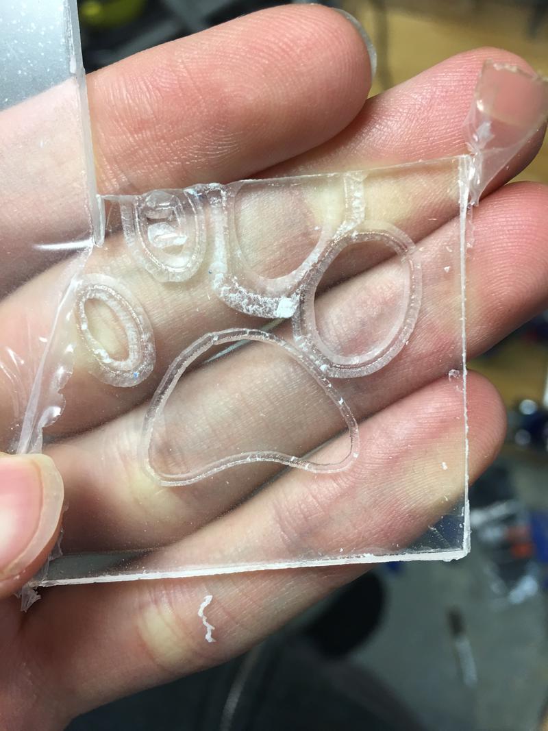
While all of these started out as solid and similarly sized filled areas, there is clearly a difference in how they were engraved.
Going from the upper left, the first one was a typical engraving. It was engraved inwards at a maximum width of 0.1 inches. This is a relatively wide engraving but useful for making certain items have a very visible line. The next one was set so it would engrave the entire interior. As you can see, because it is a V-bit, there is a lot of material left and it looks quite poor. While it is possible to pass over the same area many times it often isn’t worth it. The edge lighting effect is definitely best with fewer and more important lines. The third one was an outwards engraving, with a relatively large set width. It automatically stops as soon as it hits another object or path, preventing it from removing other details. Because it’s so big, it doesn’t have the same sharp and clean feel of the smaller engravings. The fourth is the same as the first except with an outwards engraving. It does not have a very different look, it is just larger. The final middle one is a standard 0.039" engraving. This is generally the default because it is small enough to look sharp but still large enough to properly glow.
Trying Yourself
If you’re curious on how something would look, send me a message. I’m happy to give more feedback or to try engraving your design.
If any artists feel like this kind of line work is something they’re good at please send me a message! I’d love to work something out to provide a high quality source of artwork for these badges. I’m hoping to start selling them soon and would prefer using artwork that was designed for engraving.